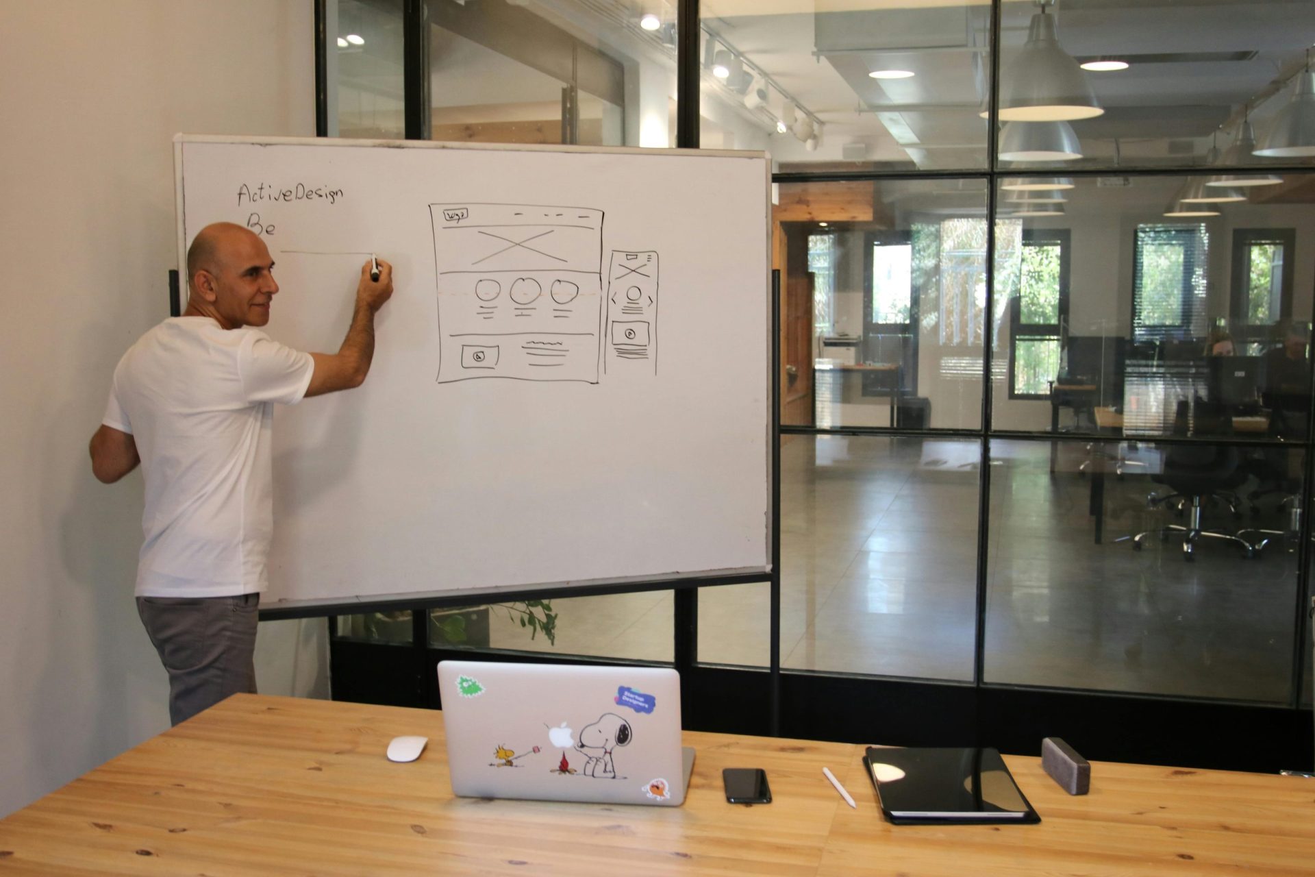
Developing a website for your business is very important to reach the digital world. But before launching your first website, you must consider a persuasive design for your website as it is the initial point through which the potential customers judge your business – consider studying what users are looking for.
User experience design is the process of designing a product with the user in mind. UX design focuses on improving the usability, accessibility, and satisfaction in interactions with your product. Customers prefer a website that uses UX design because it is easy to navigate through like finding information, filling out contact forms, browsing your products or even watching a video.
The purpose of a company’s website is usually to help or inform prospective and/or current customers. A good website should be designed around what users want from your website. For example, if you own a retail store, users may want to find your store hours or shop online. If you own a restaurant, users need to be able to find your menu quickly and the menu and making your website a mobile responsive.
UX designers must be familiar with designing images, icons, or logos based on user experience. Since every website includes different features which can influence the design such as layouts, menus, fonts, content display, color combination, interfaces, pixels, images, photos, etc. All these elements collectively make the outlook of a website and give it an expressive impression. However, a website designer should design every feature of the website cautiously and functional to achieve the intended purpose.
Consider these powerful UX design tips for your website:
Navigation
- Make navigation labels specific, no more than 2-3 words and start with the most information-carrying word.
- Good website navigation is not in the way, it disappears into the background.
Flow
- Consistent and easy-to-use web interfaces help users concentrate on the content and move through it.
- Think of the website as a yellow brick road: move users seamlessly from one section to the next by understanding user personas’ goals and needs.
Scrolling
- Your website should always provide a strong visual indication of the direction of scrolling and whether more content is available.
- The longer the website page, the less likely someone is to scroll down to the bottom.
Page Load Speed
- Website text should load before images so users can start reading before the rest of the site loads.
- Perception of website speed is based on load time, load behavior, waiting times and smoothness of animations.
Mobile Responsiveness
- Determine whether users will use devices with one hand or two when designing mobile layouts.
- The minimum size for a touch target on mobiles should be 1cm x 1cm with proper padding.
Contact Forms
- Field labels should be outside the text field, not inside, so users do not lose track of them.
- Split up sections with separators to make long web forms more user-friendly.
Call-To-Action Button
- Buttons on websites must look clickable and have enough space for users to click or tap comfortably.
- For flat designs, make sure that action buttons are done in a contrasting color with an action-oriented label.
Help Section
- Users are reluctant to use Help on your website. Put it in context and offer wizards and FAQs when appropriate.
Icons
- Icons must visually describe their function and purpose. Make them simple, familiar and meaningful.
Content
- The most important information on your webpage should always stand out as the most visually prominent, so, put key information first. Users start at the top left and the first 2-3 words are scanned the most.
Readability
- When choosing a website font, consider its legibility, readability, weights, and styles.
Users
- For example, if your mobile app development is a healthcare app for patients, make certain to consider the patients’ needs; their likely states, and possible caregivers present. Design user experience for all participants in it.


